As part of the recent Swords & Wizardry Complete reissue Kickstarter, the S&W Monster Book was also replaced by the new Monstrosities. The basic format is one page per monster, each with a picture, somewhat reminiscent of the second edition Monstrous Manual. It is a relatively large book (slightly over 550 pages), though not so large that it is unpleasant to use. The interior is all black and white.
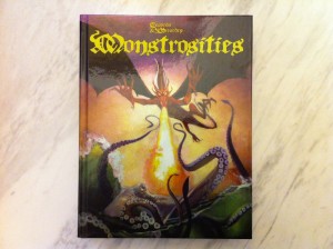
First, the positives. The cover image is evocative and unique. The rich color is gorgeous, and it avoids the looking like a cliche fantasy picture. It actually looks like a painting. I could see how the cover might not be to all tastes, but I like it. The binding is sturdy (and signature sewn). Overall, the physical artifact feels like a well-made book, and is up to the (high) bookbinding standards of Frog God Games. Each monster also includes an encounter sketch, which is a great idea.
Monstrosities further shines as an OGL reference work for module writers that want to reference classic monsters. The entire text (not the images) is OGL, and each monster has stats in single line form (convenient for copying & pasting) in addition to the AD&D multi-line key/value standard. This is actually a useful form of redundancy. The Tome of Horrors Complete included a short tutorial about how to reuse OGL monsters legally too, which would have been a nice sort of thing to include in Monstrosities.
There are plenty of good monsters contained within. Malizsewski’s HP-draining “redcap” version of the goblin has creepy fairytale atmosphere and uncommon, interesting mechanics. Sean Wills contributed an adventurer-trapping worm that lures explorers into its stomach creatively. Or Random’s parasitic spectre (it does more or less what you would expect, but it’s still a good idea, and well implemented). Just for three examples.
That said, there are also quite a few negatives. First, the interior art is mostly uninspired. It ranges from okay to downright bad (with obvious computer shading). There are a few good pieces by Jason Sholtis, though even those are often reused from other products. In the age of plentiful, inspired talent on sites like DeviantArt, this seems to be a huge shortcoming, especially in a bestiary. More samples are provided at the bottom of this post.
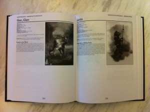
Second, and most glaring, is that many of the pages are between 25 and 50 percent blank. Some are more than half blank. While the encounter sketches are welcome, the total absence any maps was also a lost opportunity. Consider how good a book like this could have been if filled with Dyson-style lair maps? That is an as yet unfilled market niche.
Third, many pages are spent on classic monsters such as goblins. Pretty much all trad rule sets (including all three versions of Swords & Wizardry) include a good portion of these monsters. To be fair, some of these retreads are somewhat redeemed by the included encounter sketches, but I still wonder about the intended audience. There already exist good, free references of classic monsters for the original game (see every retro-clone with a free version), and of course the original Monster Manual is not hard to find. This also means that the creative, community-created monsters mentioned above are mixed in with old standbys like rocs, sahuagin, and shadows. While this is not a huge problem, it does dilute what could otherwise have been a unique bestiary with a very strong personality, like the Fiend Folio (which is now back in print!). Basically, same-old creatures feel a bit like padding (and probably inflate the price).
Some pages are almost a total wash. For example, the entirety of the useful information content on the zombie raven page are the words “zombie” and “raven.” Now, I like zombie ravens just as much as the next necromancer, but I don’t need a page of text to tell me that they can fly, that they have 1 HD, that they have undead immunities, and that an encounter with them might entail a flock. Does anybody? I can’t imagine that being useful to even a total newcomer.
Overall, there are some good ideas in the text part of the book, but the illustrations are hugely disappointing and the layout is a bad use of space. I don’t want to sound too negative–as Wayne R. writes, the encounters in Monstrosities could, strung together, make an reasonable hex crawl, and it would be interesting to see such an implied setting come into focus.
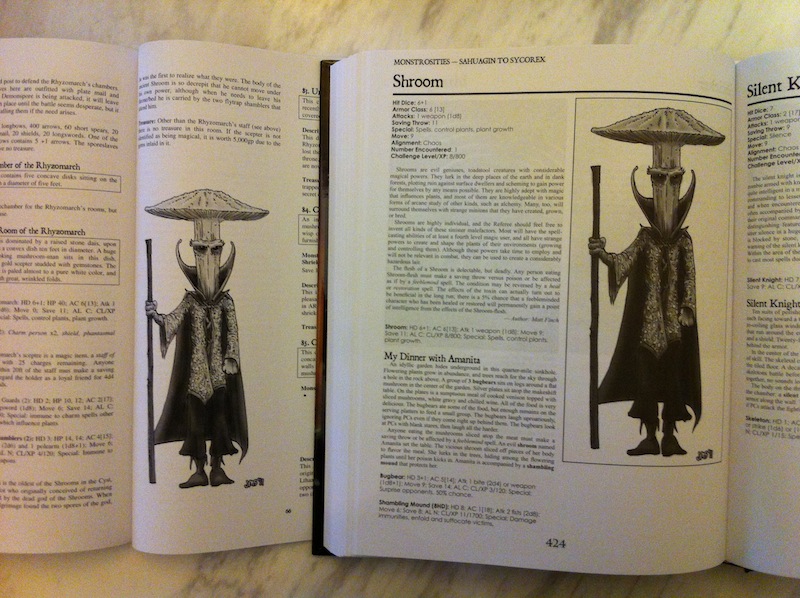
Sholtis’ shroom has a goofy majesty, but it’s also in Demonspore


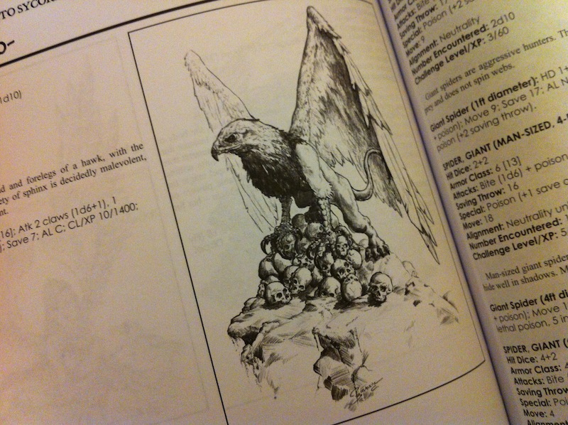
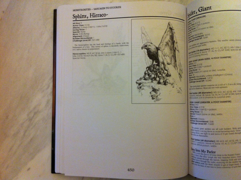
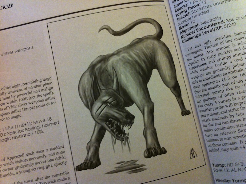
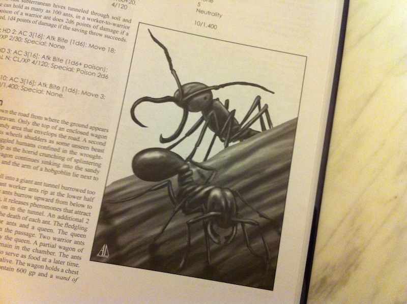
I may have illustrations in this book. Is there an evil bag of coins or a diseased zombie cat?
There is a “cat, feral undead.” The picture does not look like your style to me:
http://i38.tinypic.com/o8zdhk.png
Your name does not show up when I search the PDF, either.
That is _not_ my drawing. Apparently my work is going to be in the OSRIC book of beasts.
I don’t hate any of this art. Though the waste of space on that Sphinx just seems offensive to me.
Put *something* there. There’s always more information about a monster which can be useful, or at least interesting.
With that much empty page area, the production should have been of the “3 hole punch” variety. Then, you could run those meager pages through a printer and add a freely generated map or better art. I will agree that the cover has rich color, but I’d describe the image as two cliches fighting it out.